There is literally nothing wrong with Comic Sans
The importance of typography in communication
Comic Sans.
It’s the font we all love to hate. But what if I told you Comic Sans was a well-designed and extensively thought-out typeface? See, for what it was originally designed for, Comic Sans is everything it’s supposed to be. It was decades of misuse that saw Comic Sans become the meme-worthy monster it is today.

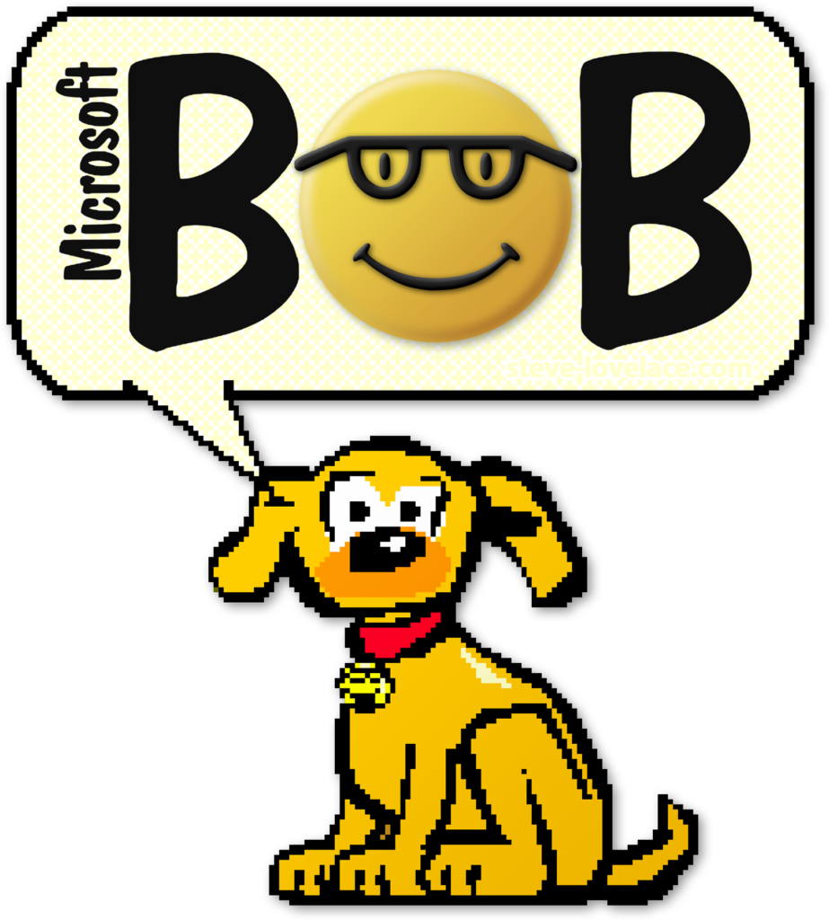
Comic Sans (CS) was originally designed in 1994 for a Beta version of ‘Microsoft Bob’. This software was designed to make early versions of Windows more user-friendly and approachable by changing the interface into a ‘house’, so your calendar was literally a calendar, files were folders on a table, and so on. As such little speech bubbles would popup and give users tips, however before the inception of CS these displayed in good ol’ Times New Roman. It was quickly decided that the speech bubbles needed to feature a friendlier font so, inspired by comic books littered throughout his office, Microsoft designer Vincent Connare set about creating one of the world’s most infamous fonts.

Fun fact: Comic Sans was also designed to be easier to read for individuals with dyslexia.
For all intents and purposes, Comic Sans is a well-designed font that does exactly what it was created to do – when used as intended. Once it was released as a standard font in Windows 95, it all went downhill for poor, misunderstood and abused Comic Sans.
When used for a children’s fete poster there is nothing wrong with Comic SansFor the average punter this is perfectly acceptable use. It all fell apart for CS when people made the decision to use comic sans for formal applications. Below are some notable examples of extremely questionable Comic Sans moments:
The European Organisation for Nuclear Research presenting its discovery of the “God Particle” in a Comic Sans riddled PowerPoint presentation.
But what does any of this mean to you? -A rational person who knows better than to use Comic Sans in your capability statement. The saga of Comic Sans is a lesson that typography says the same about a message than the words alone do. Your font choices tell your message before the viewer has a chance to process the words written.
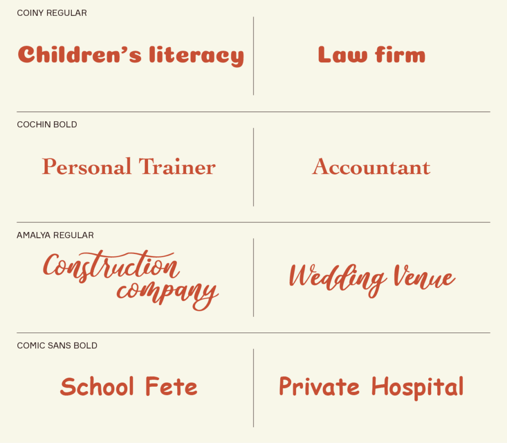
Here are some examples that show how important fonts are for communicating a brand’s message and personality. You’ll see that some are quite jarring, or just downright wrong.

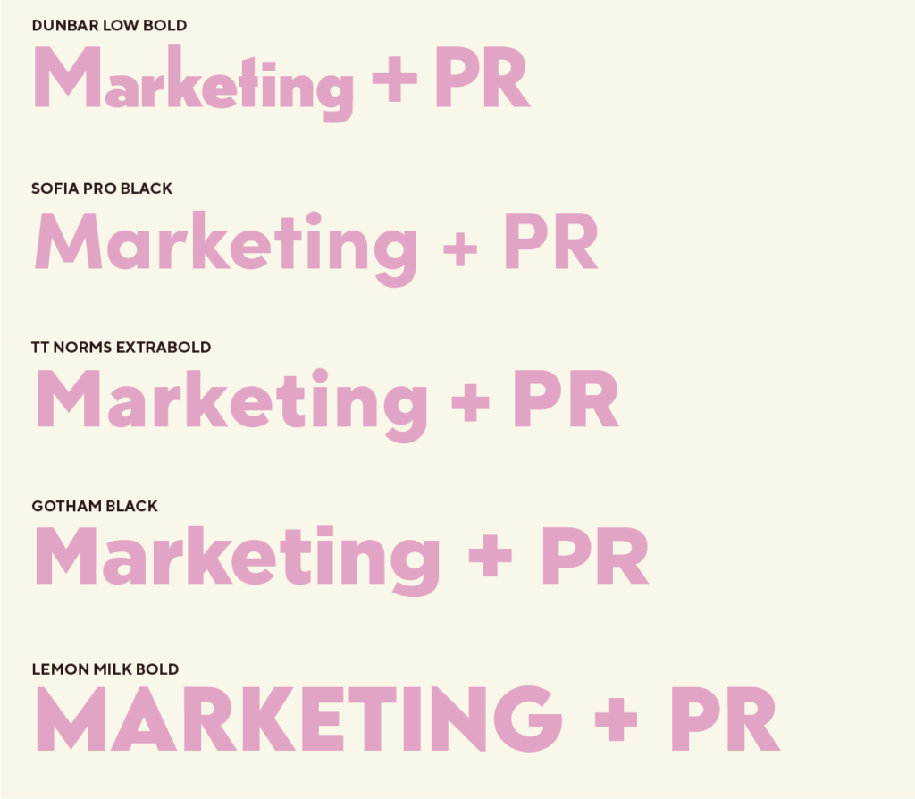
This all seems fairly obvious, right? What happens when the ‘wrong’ choice isn’t quite so clear-cut? That’s where we, graphic designers, come in. Below are five examples of sans-serif fonts that are all appropriate in their own right; however they all possess subtle traits that convey an entirely different brand personality.

When you engage with a graphic designer you are enlisting the help of an expert in telling your brand story. In one instant, before even reading the name of your brand or any knowledge of what you do, what do you want people to know about your brand? Do you want people to know you’re the no-nonsense, trustworthy experts with 20 years of experience? Or do you want people to feel excited and energised by your fun, new, edgy brand? All of these things are taken into consideration throughout the concept development stage.
Are you ready to tell your brand story with no words at all? Ok, you might need to come up with a few – but direct those to our Creative Director, Bec Kowald and we’ll take care of the rest. bec@p4.com.au
In the meantime, take a moment to reconsider the use of Comic Sans.
Written by: Beth Ierino
